 By
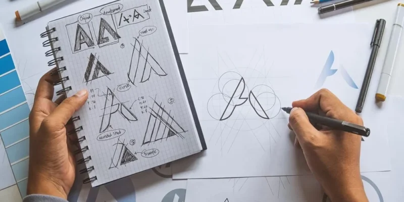
A local business is judged quickly. A passerby glances at a storefront sign in the Gaslamp Quarter or Pacific Beach, a driver notices a truck at a stoplight, a neighbor scrolls past a social post. In each case, the logo has only a moment to say who you are. Effective logo design for a local business is less about artistic flair and more about clarity, memorability, and practicality.
Does a Local Business Really Need a Professional Logo?
A logo is a visual shortcut for reputation. It appears on signs, invoices, uniforms, websites, business cards, and social profiles, and each appearance reinforces recognition. A thoughtful logo suggests care and reliability, while a rushed or inconsistent one can quietly undermine trust.
Local businesses often rely on repeat customers and word of mouth. A recognizable mark helps people recall the business when a friend asks for a recommendation. It also makes the company look established even when it is still growing.
What Does a Good Logo Actually Need to Do?
A logo is a tool, not a decoration. Before thinking about style, consider the jobs it must perform:
- Be recognizable: People should identify it at a glance.
- Be memorable: A simple, distinctive form is easier to recall.
- Be appropriate: It should suit the business, audience, and community.
- Be versatile: It must work in many sizes and on many surfaces.
- Be timeless: It should avoid fads that will look dated soon.
A logo that checks these boxes will serve the business for years, even as services and teams change.
What Is the Difference Between a Wordmark, a Symbol, and a Combination Mark?
Understanding the common types helps you choose the right direction.
Wordmark: The business name set in distinctive typography. It works well when the name is short and memorable, and it makes the company name the hero.
Symbol or icon: A graphic that represents the business without text. Symbols can be powerful but usually require time and exposure before people connect them with the name.
Combination mark: A symbol paired with the business name. This is often a strong choice for local businesses, because the name builds recognition while the icon adds personality and works on its own in small spaces such as social profile images.
Choose based on how the logo will be used. A shop with a long name may need a compact icon for social media, while a business with a short name may thrive with a strong wordmark.
How Should a Local Business Think About Its Audience and Community?
A logo should feel at home in its community. A beachside San Diego surf shop, a Little Italy cafe, and an Escondido accounting office all call for different looks. A family-owned bakery, a modern physical therapy clinic, and a plumbing company all speak to different expectations. Consider the tone customers want: friendly, professional, traditional, playful, or high-end.
Look at local competitors too. The goal is not to copy them but to avoid looking identical. A logo that stands out visually among similar neighborhood businesses is easier to remember.
How Do You Choose Colors for Logo Design?
Color communicates mood quickly. Warm tones can feel energetic and welcoming, cool tones can suggest calm and trust, and deep neutrals can feel refined. Associations vary by culture and context, so use them as guidance rather than rules.
Practical advice matters more than theory:
- Limit the palette to a few colors so the logo stays clean.
- Check contrast so the logo is readable on light and dark backgrounds.
- Make sure the logo still works in a single color for stamps, embroidery, or fax-style printouts.
- Choose colors that stand out in the local environment, such as on a storefront or vehicle.
Which Typography Choices Make a Logo Easier to Read?
Fonts carry personality. A rounded typeface can feel friendly, a sharp serif can feel traditional, and a clean sans-serif can feel modern. Legibility is the priority, especially at small sizes and from a distance.
Avoid overly decorative scripts that become hard to read on a sign or phone screen. Consider the spacing between letters, and make sure the type works in both uppercase and lowercase if the logo may appear in different forms. Using one primary typeface in the logo keeps the design focused.
Where Will the Logo Be Seen, and Why Does That Matter?
Local businesses use logos in places that large brands rarely think about. Picture the real-world uses before finalizing the design:
- Storefront and building signs.
- Vehicle wraps and door magnets.
- Uniforms, caps, and embroidered shirts.
- Invoices, estimates, and receipts.
- Yard signs and banners.
- Website headers and favicons.
- Social media profile images, which are often tiny and circular.
A design that looks wonderful on a large screen but turns into a smudge on a profile image is not doing its job. Test the logo at small and large sizes before approving it.
What Logo Versions and File Formats Should a Business Have?
A complete logo package includes several versions: a primary logo, a stacked or horizontal variation, a simple icon-only version, and one-color and reversed versions for dark backgrounds. These variations let the business use the mark confidently in different layouts.
Request vector files, which can be scaled to any size without losing quality, along with standard image files for web use. Keep organized folders so employees, printers, and sign makers always receive the correct file.
How Can a Business Avoid Common Logo Design Mistakes?
- Using stock clip art or templates that other companies may also use.
- Packing in too many details that disappear at small sizes.
- Following trends that quickly look outdated.
- Choosing colors that clash or lack contrast.
- Copying another brand’s look, which risks legal trouble and confusion.
- Designing only for the screen without thinking about print and signage.
Should a Local Business Hire a Designer or Use a Logo Maker?
Online logo makers are inexpensive and fast, but their results are often generic and may not be unique. A professional designer takes time to understand the business, audience, and goals, and creates original work that can be protected and used across many applications.
If budget is tight, invest in the essentials: a clear concept, a clean execution, and proper files. A simple but well-designed logo is better than a complicated one that looks unprofessional.
What Should a Business Prepare Before Working With a Designer?
Good design starts with a good brief. Prepare a short description of the business, its customers, and its personality. Gather examples of logos you admire and ones you dislike, and explain why. List where the logo will be used, from signs to social media.
Be open to feedback. A designer’s job is to solve a communication problem, and the best results often come from collaboration rather than strict instruction.
How Can a Business Protect and Maintain Its Logo?
Consider checking whether a similar mark is already in use in your local market before committing. Once the design is final, document usage rules, including minimum size, spacing, and approved colors. Consistency over time builds recognition, so avoid frequent tweaks.
If the business grows or changes direction, refine the logo gradually, keeping familiar elements so loyal customers still recognize the brand.
Final Thoughts on Logo Design for Local Businesses
A great local business logo is simple, memorable, and practical. It reflects the personality of the company, stands out in the community, and works across signs, vehicles, paperwork, and screens. When the design is planned around real-world use, it becomes an asset that supports recognition and trust for years.
Owners seeking professional support can explore expert logo design services, or learn more about local business marketing solutions designed for neighborhood companies across San Diego.



Comments